
In today’s data-driven world, data visualization has become an essential tool for anyone who wants to make sense of the vast amounts of information available. From business analysts to journalists to healthcare professionals, data visualization allows us to see patterns, trends, and insights that might otherwise be hidden in complex data sets. This beginner’s guide will introduce you to the world of data visualization, exploring its importance in data analysis and providing practical tips for creating effective visualizations. Whether you’re new to data analysis or just looking to expand your skills, this guide will help you unlock the power of data visualization.
What Exactly is Data Visualization?
Data visualization refers to the graphical representation of data and information. It is an effective way to communicate complex data in a clear and concise manner, making it easier for people to understand and draw insights from the data.
There are various types of data visualization techniques such as charts, graphs, maps, and diagrams. Each of these techniques has its own strengths and weaknesses, and the choice of visualization depends on the type of data being presented and the purpose of the visualization.
Data visualization is used in various fields such as business, science, engineering, and finance, among others. It is used to analyze data, track trends, identify patterns, and communicate insights to stakeholders. With the increasing amount of data generated every day, data visualization has become an important tool in data analysis and decision-making.
Why is Data Visualization Important in Data Analysis?
Data visualization is important in data analysis for several reasons:
- Simplifies Complexity: Data visualization helps to simplify complex information and communicate insights more effectively than raw data or text. By presenting data in a graphical or visual format, it’s easier to understand patterns, trends, and relationships that might not be apparent in a table or text.
- Identifies Trends and Patterns: Data visualization helps to identify trends and patterns in data, which can help to uncover insights that might not be immediately obvious. This can help decision-makers identify opportunities, potential issues, or areas for improvement.
- Enhances Communication: Data visualization makes it easier to communicate insights to a wide range of audiences, regardless of their technical or statistical knowledge. By using visual aids, you can convey complex ideas in a more intuitive and accessible way, making it easier for stakeholders to understand and engage with the insights.
- Improves Decision-Making: Data visualization can help decision-makers make informed decisions by providing insights that might not be available through other methods. By visualizing data, you can quickly and easily see the relationships between different variables and make decisions based on the most relevant information.
Overall, data visualization is an essential tool in data analysis because it allows us to better understand complex information, identify trends and patterns, and communicate insights effectively.
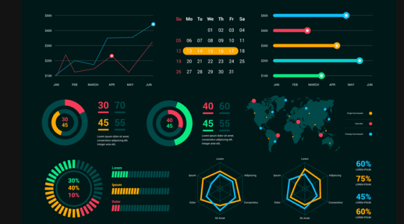
Types of Data Visualization
There are many types of data visualizations, and the appropriate type of visualization will depend on the type and nature of the data being presented. Here are some common types of data visualizations:
- Charts and graphs
- Maps
- Infographics
- Dashboards
Choosing the Right Visualization
Choosing the right visualization is a crucial aspect when portraying your data. Here are a few steps to take when making that choice:
- Understanding your data: To select the appropriate chart or graph type, it is essential to understand your data. Consider the data type, the number of variables, and the relationships between them. This will help you determine the best way to present the information.
- Identifying the purpose of your visualization: The purpose of your visualization should be clear. Is it to show a comparison, a trend, or a distribution? Understanding the purpose of your visualization will help you select the appropriate chart or graph type.
- Selecting the appropriate chart or graph type: There are various types of charts and graphs available, including bar charts, line charts, scatterplots, histograms, and more. Choosing the right type of chart or graph depends on the data you are presenting and the purpose of your visualization.
Designing Effective Visualizations:
Your visualizations must be able to portray your data perfectly. Let’s look at some facts to consider.
- Best practices for visual design: When designing visualizations, there are several best practices to follow, such as keeping it simple, using clear and concise labels, avoiding clutter, and ensuring that the design is visually appealing.
- Using color effectively: Color can enhance the visualization and make it more appealing, but it can also be distracting if used excessively or inappropriately. Use color strategically to highlight specific information and ensure that the color scheme is accessible for all users.
- Adding interactivity to visualizations: Interactivity can help users engage with the visualization and explore the data more effectively. Consider adding interactive elements such as tooltips, filters, and animations to enhance the user experience.
Tools for Data Visualization
Choosing the right tools has a huge impact on your data visualization output, lets take a look;
- Popular data visualization software and tools: Some of the popular data visualization software and tools include Tableau, Power BI, QlikView, and D3.js. These tools provide a range of features and capabilities to create interactive and visually appealing visualizations.
- Open-source options: Open-source options for data visualization include R, Python, and JavaScript libraries such as Plotly, Bokeh, and Matplotlib. These tools offer flexibility and customization options for creating custom visualizations.
- Online visualization tools: Online visualization tools like Google Charts, Infogram, and Canva provide easy-to-use interfaces to create visually appealing charts and graphs quickly. These tools are ideal for creating simple visualizations without the need for programming skills.
Conclusion
Data visualization is a powerful tool that helps us understand complex data sets and communicate insights effectively. As a beginner in data analysis, understanding the principles of data visualization and choosing the right visualization techniques can make a significant difference in how well you can communicate your findings to others. Effective data visualization can help you identify patterns, trends, and outliers that might be missed in raw data. It also allows you to present your findings in a clear, concise, and compelling manner, enabling you to make informed decisions and drive meaningful actions. With the availability of various data visualization tools and platforms, it has never been easier to create compelling visuals that communicate data insights to diverse audiences. By mastering data visualization, you can unlock new insights, solve problems, and make better decisions.