

Data visualizations are a powerful tool for communicating complex information and insights, but their effectiveness depends heavily on design choices such as the use of color. Color can be used to highlight key data points, create visual hierarchy, and convey important information to the viewer. However, the wrong use of color can also lead to confusion, misinterpretation, and visual overload. Therefore, it’s crucial to understand the principles of color theory and how to use color effectively in data visualizations. In this article, we’ll explore the key principles of using color in data visualizations and provide practical tips for designing effective and visually appealing visualizations.
Color Theory
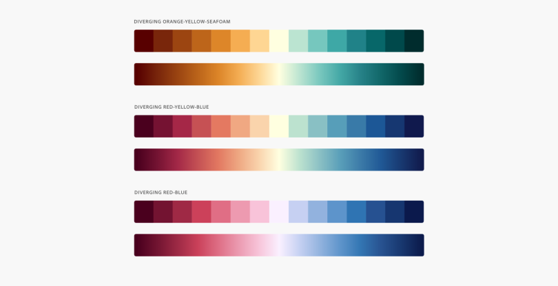
Color theory is an important foundation for understanding how to use color effectively in data visualizations. At its core, color theory is concerned with how colors interact with one another, and how they can be combined to create effective and aesthetically pleasing color schemes. Three key concepts to consider when working with color are hue, saturation, and brightness. Hue refers to the color itself, such as red or blue. Saturation refers to how pure or intense the color is, while brightness refers to how light or dark the color is.
When choosing a color scheme for a data visualization, there are many options to consider. One popular approach is to use complementary colors, which are colors that are opposite each other on the color wheel (e.g., red and green, blue and orange). Complementary colors create a high level of contrast, making them effective for highlighting key data points or creating visual interest. Another approach is to use analogous colors, which are colors that are adjacent to each other on the color wheel (e.g., red, orange, and yellow). Analogous colors create a sense of harmony and unity, making them effective for creating a cohesive design.
Choosing Colors for Data Visualizations
When choosing colors for a data visualization, it’s important to consider the purpose of the visualization, the audience, and the data being presented. For example, if the visualization is being used to highlight a particular trend or outlier, a bright or contrasting color might be appropriate. However, if the visualization is intended to convey a sense of calm or neutrality, muted or monochromatic colors might be more appropriate.
In addition, it’s important to use a limited color palette to avoid overwhelming the viewer with too many colors. Using too many colors can create a cluttered and confusing visualization. A general rule of thumb is to use no more than four or five colors in a single visualization.
Another important consideration when choosing colors is accessibility. Around 8% of men and 0.5% of women have some form of color blindness, so it’s important to design visualizations that are accessible to these individuals. One way to design for accessibility is to use high contrast combinations between the foreground and background colors. Another way is to label the axes and data points to ensure that the viewer can understand the information being presented even if they cannot distinguish certain colors.
Using Colors in Different Types of Visualizations
The effective use of color depends on the type of visualization being used. For example, in a bar chart, it’s important to use a consistent color scheme to represent different categories. In a scatter plot, color can be used to represent a third variable, such as time or a categorical variable. In a map, color can be used to highlight geographic patterns or differences.
It’s important to use color consistently and purposefully throughout a visualization. Inconsistent use of color can create confusion and detract from the overall impact of the visualization.
Designing for Accessibility
Designing data visualizations with accessibility in mind is an important consideration, particularly for individuals with color vision deficiencies. One way to design for accessibility is to use high contrast combinations between the foreground and background colors. Another way is to label the axes and data points to ensure that the viewer can understand the information being presented even if they cannot distinguish certain colors.
Conclusion
The use of color is a powerful tool in data visualization design, but it’s important to use it effectively and purposefully. By understanding the principles of color theory, choosing appropriate colors for the purpose and audience, and designing for accessibility, you can create effective and visually appealing data visualizations that effectively communicate complex information and insights.