

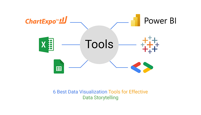
Data visualization is an essential tool for understanding and communicating complex information. Whether you’re analyzing business data, scientific research, or social trends, visualizing data can help you identify patterns, spot trends, and communicate insights more effectively. With so many tools and platforms available for creating data visualizations, it can be challenging to know where to start. In this post, we’ll take a look at some of the best tools and platforms for creating data visualizations, including Tableau, Power BI, Google Data Studio, and Excel. We’ll explore the features, advantages, and disadvantages of each tool, and provide examples of effective data visualizations created with each platform. By the end of this post, you’ll have a better understanding of the different tools available for creating data visualizations and be able to choose the best option for your needs.
Tableau
Tableau is a popular data visualization tool that offers a wide range of features and functionality for creating interactive and dynamic data visualizations. With Tableau, you can create a variety of charts, graphs, and maps, and connect to a range of data sources, including spreadsheets, databases, and cloud services.
Advantages of using Tableau include its user-friendly interface, powerful analytics capabilities, and robust community of users and developers. Some of the disadvantages of using Tableau include its high cost, limited customization options, and steep learning curve.
Examples of data visualizations created with Tableau include interactive dashboards that allow users to explore data in real-time, heat maps that show geographic patterns, and scatter plots that highlight relationships between different variables.
Power BI
Power BI is a data visualization tool developed by Microsoft that allows users to connect to a wide range of data sources, including Excel spreadsheets, SQL databases, and cloud services. With Power BI, you can create a range of charts, graphs, and maps, and customize your visualizations with colors, labels, and annotations.
Advantages of using Power BI include its integration with other Microsoft tools, such as Excel and SharePoint, its ease of use, and its ability to handle large datasets. Some of the disadvantages of using Power BI include its limited customization options and its dependence on other Microsoft tools.
Examples of data visualizations created with Power BI include interactive dashboards that allow users to drill down into data, maps that show geographic trends, and line charts that highlight changes over time.
Google Data Studio
Google Data Studio is a free data visualization tool that allows users to create interactive dashboards and reports using data from a range of sources, including Google Sheets, Google Analytics, and Google Ads. With Google Data Studio, you can create a range of charts, graphs, and maps, and customize your visualizations with colors, labels, and annotations.
Advantages of using Google Data Studio include its ease of use, integration with other Google tools, and its affordability. Some of the disadvantages of using Google Data Studio include its limited functionality compared to other tools, such as Tableau and Power BI, and its lack of customization options.
Examples of data visualizations created with Google Data Studio include interactive dashboards that allow users to explore data in real-time, pie charts that show the distribution of data, and bar charts that highlight changes over time.
Excel
Excel is a widely used spreadsheet program that also offers data visualization features, such as charts, graphs, and pivot tables. With Excel, you can create a range of basic visualizations using data from a variety of sources, including spreadsheets and databases.
Advantages of using Excel for data visualization include its ease of use, affordability, and familiarity to many users. Some of the disadvantages of using Excel include its limited customization options and its inability to handle large datasets.
Examples of data visualizations created with Excel include bar charts that show changes over time, line charts that highlight trends, and scatter plots that illustrate relationships between variables.
Other tools and platforms
In addition to the tools and platforms discussed above, there are many other options available for creating data visualizations. Some popular options include:
- D3.js: A JavaScript library for creating interactive and dynamic visualizations
- QlikView: A data discovery and visualization tool for creating interactive dashboards
- IBM Cognos Analytics: A business intelligence and analytics platform for creating custom reports and visualizations
- SAP Lumira: A data visualization tool that allows users to create interactive visualizations using a drag-and-drop interface.
- Bokeh: A python library for creating interactive and dynamic data visualizations in web browsers
Conclusion
There are many different tools and platforms available for creating data visualizations, each with their own advantages and disadvantages. Choosing the right tool depends on your specific needs and the complexity of your data. If you’re looking for a user-friendly and powerful tool for creating interactive dashboards and reports, Tableau and Power BI are great options. If you’re looking for a more affordable and simple tool, Google Data Studio and Excel might be the best fit. Whatever tool you choose, remember that data visualization is a powerful tool for understanding and communicating complex information, and can help you make informed decisions based on your data.